A Deep Dive into NativeScript UI's AutoCompleteTextView
As mobile developers, our job is to delight users with easy to use and engaging mobile experiences - creating apps that require a minimal amount of user input to produce a maximum amount of enjoyment. Part of that means less typing, fewer taps, and a quicker way to completing a task.
Hopefully you've been following along all week as we've been diving deep into the nuts and bolts of NativeScript UI. With NativeScript UI, we are doing our best to help you create these engaging experiences and create apps that your users actually want to use.
This article is part of our "week of NativeScript UI" that covers the how-to of each NativeScript UI component. Today is all about the AutoCompleteTextView, and we will have an in-depth article for each component in our offering:
- ListView
- Chart
- SideDrawer
- DataForm
- AutoCompleteTextView
- Calendar
What is NativeScript UI?
NativeScript UI is a set of premium UI components for native cross-platform mobile apps written with the NativeScript framework. Our goal is to simplify NativeScript app development by providing pre-built, ready-to-use, components that are easy to implement in your app (and equally as easy to style to match your app's look and feel).
Let's get started with learning all about the AutoCompleteTextView component.
AutoCompleteTextView (a.k.a. RadAutoCompleteTextView)
The AutoCompleteTextView component (known in code as RadAutoCompleteTextView), allows you to provide users with auto-completion for text entries - maybe you are filtering a list or providing an alternative to a multi-select input.
With RadAutoCompleteTextView and a splash of CSS, input scenarios like this on iOS and Android are made easier:
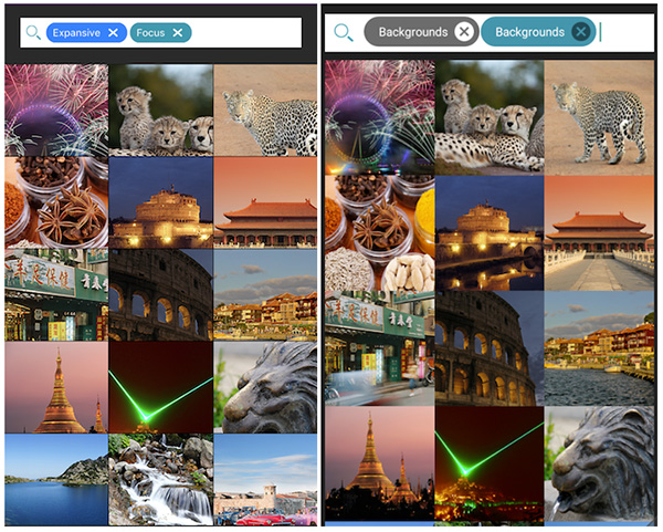
With RadAutoCompleteTextView you put your users in control by reducing data entry requirements. You can specify different text-suggestion modes as well as define how those suggestions are displayed.
Installing NativeScript UI's AutoComplete
Navigate to your NativeScript project directory and install NativeScript UI AutoComplete with the following command (no manual download required):
tns plugin add nativescript-ui-autocompleteGetting Started with RadAutoCompleteTextView
Note that all of the code demonstrated here is available in this GitHub repo. For more code samples, check out the official NativeScript UI sample repo.
Plugin installed? Great! Now we'll need to add an XML namespace to the root of the page where we want to use RadAutoCompleteTextView. If "XML namespace" scares you, have no fear. You just need to add a property to your root <Page> element, like this:
<Page xmlns:au="nativescript-ui-autocomplete">
Finally, we need to add a RadAutoCompleteTextView component to our XML markup, as in:
<Page xmlns:au="nativescript-ui-autocomplete">
    <au:RadAutoCompleteTextView id="myAutoComplete" />
</Page>
It doesn't stop there! Let's wire up some data and see what RadAutoCompleteTextView can do.
AutoComplete Example
Let's get a RadAutoCompleteTextView component running with a minimal amount of code. Starting with our XML markup:
<Page xmlns:au="nativescript-ui-autocomplete" xmlns="http://schemas.nativescript.org/tns.xsd" loaded="pageLoaded">

    <ActionBar title="RadAutoCompleteTextView Demo" class="action-bar" />

    <StackLayout class="stack-layout">
        <Label text="Artist:" class="label" />
        <au:RadAutoCompleteTextView items="{{ items }}" suggestMode="Append" displayMode="Token">
            <au:RadAutoCompleteTextView.suggestionView>
                <au:SuggestionView suggestionViewHeight="300">
                    <au:SuggestionView.suggestionItemTemplate>
                        <StackLayout>
                            <Label text="{{ text }}" />
                        </StackLayout>
                    </au:SuggestionView.suggestionItemTemplate>
                </au:SuggestionView>
            </au:RadAutoCompleteTextView.suggestionView>
        </au:RadAutoCompleteTextView>
    </StackLayout>

</Page>
I realize we are going 0-60 in about 3 seconds so bear with me as I walk through this markup:
- We added a
pageLoadedfunction to theloadedevent (see below). - We inserted an
ActionBarto show a title in our view. - We added both
suggestModeanddisplayModeproperties, which we will discuss later on. - We added an
<au:RadAutoCompleteTextView.suggestionView>element which is a fancy name for what is effectively a placeholder for our autocomplete suggestions.
Next, we need some JavaScript to make it all work:
var Observable = require("data/observable").Observable;
var ObservableArray = require("data/observable-array").ObservableArray;
var autocompleteModule = require("nativescript-ui/autocomplete");

var page;
var pageData = new Observable();
var items = new ObservableArray([]);

exports.pageLoaded = function(args) {
    page = args.object;
    page.bindingContext = pageData;

    var artists = ["Arcade Fire", "Bon Iver", "Daft Punk", "Elbow"];

    for (var i = 0; i < artists.length; i++) {
        items.push(new autocompleteModule.TokenModel(artists[i]));
    };

    pageData.set("items", items);
};
In this code block we have our pageLoaded function, which is executed when our main view/page loads. Within this function, we are looping through the artists array and adding items to our items observable array (which is what we use as our data source for autocompletion).
Looking for Angular code samples? Check out our complete docs for Angular as well!
This all results in the following:
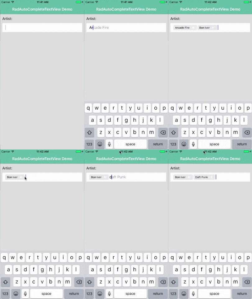
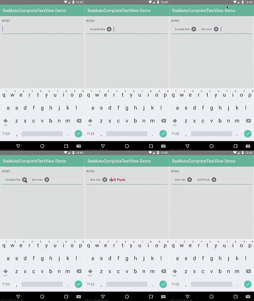
Note that the styles you see come from the core light theme that is part of NativeScript, plus some customizations made with the NativeScript Theme Builder.
AutoComplete Suggestion Modes
In the example above, you probably noticed the suggestMode property, which has the following options:
- Suggest
- Append
- SuggestAppend
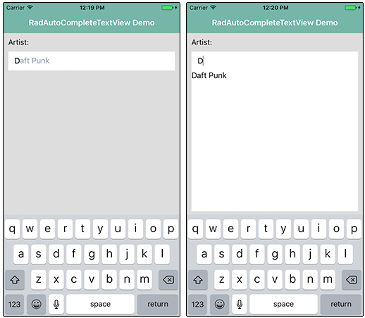
Suggest (the default option) provides a drop-down list of options for you to pick from. Append (as we used above) provides an inline display of the first suggestion. And as you probably guessed, SuggestAppend combines the functionality of the two.
Different Display Options
As with using radio buttons vs checkboxes on the web, RadAutoCompleteTextView lets you choose between a single option or a multiple choice option. This is accomplished using the displayMode property, which as two options:
- Plain
- Tokens
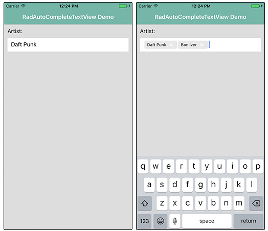
Plain (the default display option) simply allows for one selection per RadAutoCompleteTextView control. Tokens on the other hand (which we used above) allows for multiple selections and the ability to delete previously selected items.
Customizing Suggestion Item Template
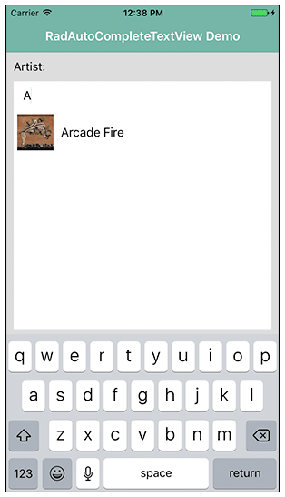
Displaying autocompletion options as text is very useful, but what if we want to spice things up a bit and include, for instance, images? That's the point of the item template found in the <au:RadAutoCompleteTextView.suggestionView> element.
Let's first change our suggestMode to be suggestMode="Suggest" so we get the full drop-down experience to see our images.
Next, let's make a change to our markup and swap out our existing StackLayout element with this:
<StackLayout orientation="horizontal" margin="5">
    <Image src="{{ image }}" width="50"/>
    <Label text="{{ text }}" marginLeft="10" />
</StackLayout>
Finally, we need to alter our array and our for loop in the code-behind JavaScript to pass in an image along with the text:
var artists = [
    {
        text: "Arcade Fire",
        image: "~/images/arcade-fire.png"
    },
    {
        text: "Bon Iver",
        image: "~/images/bon-iver.png"
    },
    {
        text: "Daft Punk",
        image: "~/images/daft-punk.png"
    },
    {
        text: "Elbow",
        image: "~/images/elbow.png"
    }
];

for (var i = 0; i < artists.length; i++) {
    items.push(new autocompleteModule.TokenModel(artists[i].text, artists[i].image));
};
Which all results in a little more pleasing UI:
